Gmail Is Being Revamped, New Design Leaked – Here Are Three Exciting Features!
After almost 3.5 years, Google has confirmed that a new layout and few new features would be soon introduced in Gmail.

Gmail, the email service from Google is right now used by more than 25% of global internet users. Launched in 2004, Gmail is a free email application, supported by advertisements.
The last time Google implemented a change in the design of Gmail was in 2014.
Now, after almost 3.5 years, Google has confirmed that a new layout and few new features would be soon introduced in Gmail.
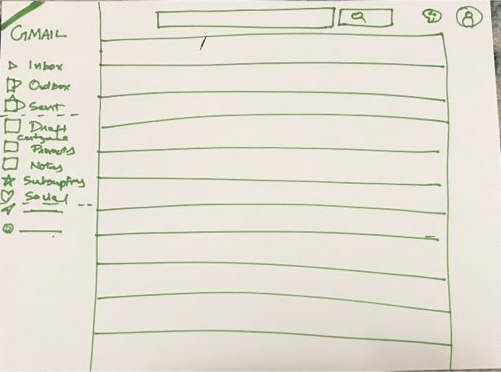
Meanwhile, a rough sketch of the new Gmail interface has surfaced online, which has been shared by an Indian, who saw a Google employee working on it in a public transport!
3 New Features In Gmail: Confirmed!
Google has mailed to all G-Suite users about the implementation of the new design. While sharing this new development, Google has also hinted about three possible changes, which would be implemented in the new design.
These are:
- Offline Support For Emails: Now, users can access emails, stored in an offline location, without using the Internet. This also means that Google is decentralizing email content, which is a big, bold step.
- Snooze Option: Gmail users will be soon able to snooze emails from particular senders, which will allow them to recheck the mails after a specific time. This can be a pretty useful feature for those who are overwhelmed with lots of new emails and need some time to check out new emails. Simply snooze emails, and then they will reappear after a specific time.
- Google Calendar: And, finally, Gmail users will be able to check Google Calendar directly from the Gmail interface. This was a much sought-after feature from Google, which is finally being introduced. Outlook users will be mightily impressed with this new add-on, and this can become one of the reasons for their migration as well.
Gmail’s New Design Leaked?
Meanwhile, a Twitter user named Sahil Bhutani has shared a sketch of what possibility can be the new Gmail interface. This was shared with Techcrunch and as per them, Sahil saw a Google employee working on the new interface in a public transport.
Sahil has sketched the interface based on his alleged observations.
Here is the sketch:

The background of this interface had a bluish shade, and the folders were divided into several categories. Sahil said,
“It was a hybrid of Gmail and Inbox. The left-side column was more like inbox.google.com and the right side was an enlarged version of Gmail.”
Google hasn’t yet confirmed about this new design.
We will keep you updated, as we receive more inputs.
