Uber Mobile App Gets A Huge Update; Brings Destination Shortcuts, Ride Cost Comparisons and More…

Uber, the largest ride-hailing company in the world, announced the redesign of its logos early this year, which was the biggest update for the company since its launch in 2009. Subsequently, Uber introduced upfront fares globally, but the app remained pretty much the same.
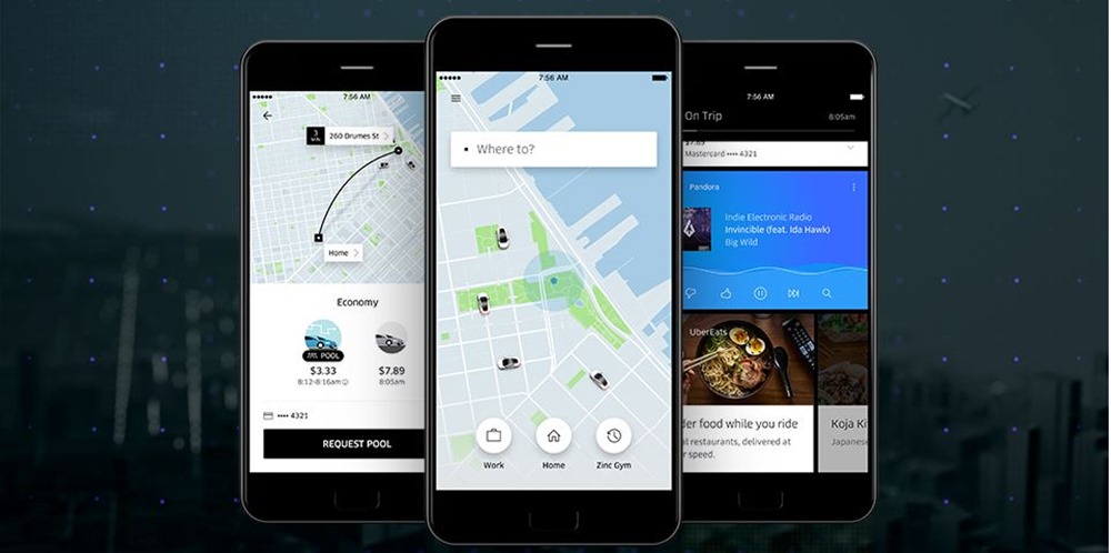
The biggest update since February 2016 has come in the form of a redesigned app – with Uber’s solution to the question ‘Where to?”. Uber wants to make it as short as possible for the rider to book a cab, with a simple push of the ride button. And this makes sense as well, because you don’t want to keep fiddling with your phone to get a cab.
Uber itself feels that it has become complicated to book a ride from A to B, and does not want you to get confused with all the technicalities. The company claims that this new update has made the app faster and smarter, built completely from scratch.
At the moment you have to enter your pickup location and the destination, but this new update will only request you to enter your destination in ‘Where to?’, making it easier to choose a destination.
The blog post read, “We designed the new Uber app around you—and our core beliefs that time is a luxury and that the information you need should always be at your fingertips. The new Uber experience is reimagined around a simple question – “Where to?”. After all, you use Uber to get somewhere—or to someone. And by starting with your destination, we can tailor the journey to you.”
Contents [hide]
Key updates in the new Uber rider app
The new update tries to make it as short as possible for the rider to book a cab from the starting point to the destination. Through machine learning, the app will suggest you places you go to regularly, depending upon the time of the day.
Logo update
The existing Uber logo represent bits and atoms in technology, and can be seen as a white circle with a square in the middle and a pipe connecting it to the background. The new logo has the same design, but with a different colour scheme.
Just like other companies, the app logo follows a minimal approach. Instead of a background around the white circle, the new logo excuses the background and only shows the white circle with a black interior square and pipe. The colour scheme also supports the fact that Uber is trying to make it as simple as the rider, black and white, to book cabs.
Destination shortcuts
If you’re not aware of it right now, Uber allows you to assign specific destinations you regularly travel to. For example, you can assign home, office, gym, movie theatre and restaurants you regularly travel to, so that you don’t have to input these every time you want to take a ride.
Making this transition of choosing saved destinations even further, you’ll see “shortcuts” that predict where you could be headed. These shortcut buttons will pop-up at the bottom of the screen. So when you’re done from office, the app will suggest you home immediately, saving a few keyboard clicks and definitely some time.
Calendar integration
Soon you’ll also be able to connect your calendar with Uber. Once you connect, your meetings and appointments will automatically appear as “shortcuts,” saving you the hassle of digging through another app to find the right address.
This integration will allow you to be at the destination without worrying about figuring out the address and making a trip in advance to ensure you’ll be at the right spot.
Input friend’s location
This is probably the most awaited update – how many times have you wondered why Uber doesn’t allow you to input your friend’s shared location directly into Uber, so that you can simply reach the exact destination? Uber finally has an answer to it.
The company will soon be introducing a new feature they refer to as “people are the new places” that enables you to set your destination to a person instead of a place. Just sync your contacts with the app, type their name into the search bar and once they’ve shared their location, you’ll be on your way.
Ride tariff comparison
Now that you have input your destination, the app will allow you to easily check the tariffs from different Uber cabs around you. For instance, when you see the fare for UberGo, UberX will be available on a small swipe to the right, instead of opening it separately.
This will also provide you upfront fares and ride duration comparisons so that you can make a smarter choice. Uber will also integrate post-ride transit options, so that you can plan your trip according to schedules of flights and trains.
Uber is all set to take on the global cab-hailing business
This Uber update will be rolling out globally in the coming few weeks, on both iOS and Android. This is by far the biggest update from the company, and adds so many nifty features that users have been waiting for.
Uber’s integration with other services like calendar and user locations will make it easier for people to take a cab to their destination. The app will keep learning about your ride behaviour and suggest your destinations accordingly. The only thing now left is a personal assistant, which we feel Uber will introduce by next year.
Let us know what you think of the new app and whether it is enough for you to switch from Ola.
Source: Uber Newsroom

I hope Ola is tough Competitor for Uber in India Market.