After Flipkart, Myntra Too Admits Their App-Only Mistake; Officially Announces Mobile Site Relaunch

The best part of digital marketing is that, every click, every impression, every action of the end user is measurable and quantified. It seems Myntra has finally discovered the preferences of their users; and have made a very crucial decision about their presence.
Maybe the eye candy didn’t work?
After shutting down their mobile website last year, and converting into app only shopping medium, Myntra has officially announced their relaunch of mobile site. As per available reports, Myntra has made this transformation after observing the user behavior and their reaction to app only medium.
Last year in December, we had presented an exclusive report which showcased that Myntra is working on their mobile site, and we had speculated that it will be opened very soon. Myntra had refused to comment last year; but now, they have explained their position.
Ambarish Kenghe, head of products at Myntra said, “During the sale, we got reasonable data that many people were using the mobile site and now, we are reopening it for good,”
This statement clearly reflects the fact that Myntra has been losing orders due to their app-only ‘diktat’, and they have now realized that this strategy won’t work.
However, they are not willing to admit that this decision has something to do with revenues. He further said, “But this is not a revenue-related decision. We want to give customers an additional reason to use Myntra. This move will eventually result in more app installs.”
The Current Look & Feel Of Mobile Site
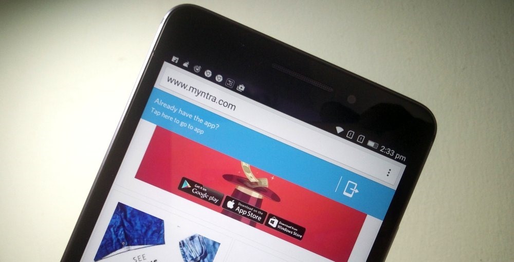
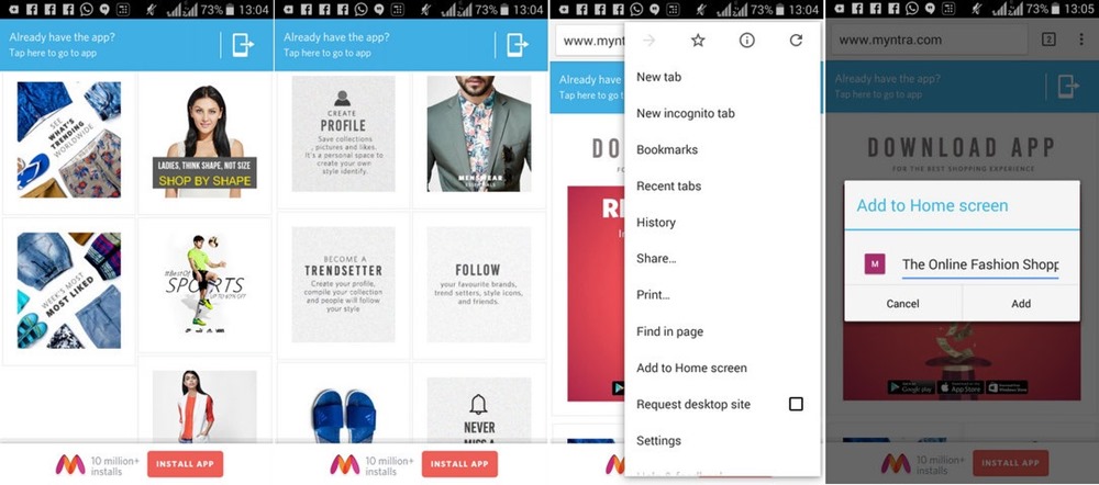
As we explored Myntra.com on mobile, we found that the upper fold is still prompting us to download the app; and once we click on any category, the browser redirects to their app (and in case app is not installed, then redirects to app store).
The one major change which we observed was the option to add the icon of Myntra.com’s mobile site on the home screen of the mobile.

This may have been done to replicate the experience of an app; and to ensure that push notification keeps on working for the site, even if app is not installed.
The intentions are , ofcourse, to nudge, entice the user towards downloading the app.
As Kenghe said, “The relaunch of the mobile site is not a change in our strategy. We continue to be heavily focused on our new app. The mobile site will be functional and the app offers a far superior experience. We will keep nudging users to the app even on the mobile site (which will have a link to the app). The site will provide more information to customers before they start using the app,”
Interestingly, both Flipkart and Myntra had closed down their mobile sites last year, in order to promote their apps. Now, both of them are back to the basics. In November last year, Flipkart had admitted their mistake, and relaunched their mobile site.
Myntra’s desktop site is still not operational (since May, 2015), as the customer is forced to download their app in order to shop online. Thankfully, Amazon, Jabong and Snapdeal have flatly refused to follow Myntra’s example, as they are aware that not everyone is willing to download apps, and then face the torture of continuous push notifications, battery drainage and lack of space.
Will you use Myntra’ app once their mobile site is launched? Do share your views by commenting right here!

[…] After Flipkart, Myntra Too Admits Their App-Only Mistake; Officially Announces Mobile Site Relaunch […]
@Myntra, please get your desktop website back.