I have been a big fan of Cleartrip for past couple of years. It has been my de-facto site for searching and booking Plane and Train tickets. One of the main reasons I like cleartrip was its excellent UI experience. It is simple, fast and intuitive. It was/is by far one of the best and did not really need any tinkering.
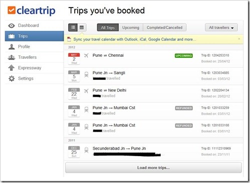
However, I was in for a surprise today morning when I logged in to print tickets for one of my future journeys. They made their already excellent UI even better. The UI is much more faster and simpler. They seem to have adopted the Google’esque approach to design. And, it is now more social as well!
[Note: Cleartrip homepage is still the same, but the dashboard has been redesigned]

What I really like about this UI, is that it is supremely fast. Cleartrip has used latest technologies like AJAX and ensured minimum page loads for users. The “trips” page list down the past and future trips beautifully and what’s more, it can very easily be linked with your Google Calendar (This is going to be a blessing for regular travelers).

The new dashboard is definitely more social, where one can connect their Facebook account and import their profile details. Cleartrip is now storing profiles of users separately and users account will show up profiles of all the travelers for whom the tickets have been booked earlier through that account.
Cleartrip’s new “Expressway” feature is designed to minimize users effort as it securely stores the credit card / transaction data so that users do not have to enter it repeatedly (this one feature I really longed for..). Apart from all these features, users now have capability to set their preferred transaction currency.
Overall, I think cleartrip has raised the bar even further – and users are sure to like the new redesign. Well done Cleartrip Team!
Give the new cleartrip dashboard a spin and let us know what you think!

I too love Cleartrip's site design. And their pdf tickets – just so freaking awesome.