How To Design Website Which Make Users Happy? Checkout 7 Professional Tips!
Website design can make or break your website's reputation, infront of your users.

Designing your new website today has become more challenging than ever. A good website design is the one serving an ideal content visibility with the right structure.
However, crafting that correctly is the most quintessential thing a new website needs. For a new website, what matters the most is user experience. Providing its audience a seamless experience can be huge for any website’s initial growth.
“ The audience scans your website first and then reads it ”
In this article, I am going to raise, answer, and discuss three essential questions related to the essence of an apt design and structure for your new website.
- Why are design and UX a big deal for new websites?
- What areas can be covered with a subtle design?
- How to achieve a well-structured website?
Let’s get started.
Why Are Design and UX a Big Deal for New Websites?
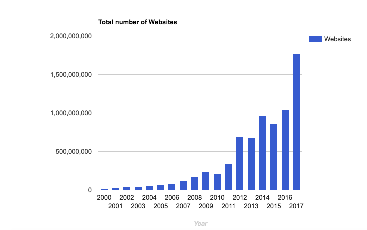
- Every year the website count increases immensely in all the domains and sectors. More the number of websites, more the options of users. When I say options, I mean both good and bad. There could be websites sufficing the needs of the users. There could be websites misleading the users. All in all, their count is increasing.

Therefore, a well-designed website, with the apt content visibility can work just the way you want it to. This is because, for your new website, it can serve the following purposes:
- Conveying the ‘Why’ or the purpose of your website
- Giving the correct first impression to your debut audience
- Ensures that your website content is optimally visible to your audience
- Engages the audience for a longer time
- Helps in improving your page visit duration and sessions on your website
- Leaves better chances for user retention or loyalty
- Helps in bringing more revenue to you. For instance, a clearer call to actions (CTAs) can engage more users.
What Areas Can Be Covered With A Subtle Design?
- A balanced design opens many gates for your website. Considering the fact that your website is new, the design is what will help you get the right push. The following could be few of many segments you can streamline with the right structure.
- Response rate: The response rate of your website becomes optimum with the correct design. A better response rate means a better user experience (UX).
- Search Engine Visibility: Having the right structure gives your website better readability in terms of search engine crawlers. It also enables the passing of a correct intent to the search engines. Being a new website, the best thing that can have is to attain a search engine presence. Better search engine visibility, in turn, means more audience for you.
- Less coding and technical complications: Getting rid of the unwanted or over-designing clutter can actually help your website run through clean and seamless lines of code. This, in turn, can help you maintain, debug, or improve your website over the years.
- Development expenses: Having clarity of what design should be implemented, gives an expense bracket for your website. Being a new website, it is necessary that you focus on the development costs. A better UI helps you control additional expenses on experimental designs and saves time in turn as well.
How to Achieve a Well-Structured Website Design?
- Having discussed the importance of website design and what benefits it can give, now is the time to focus on the ways we can achieve it. Doing what can give my audience a seamless experience? Let us look into some basic but relevant things that we need to cover for a better User Interface –
- Content Placement: Users scan your page before they start reading your page’s content. It becomes highly relevant to place your content on the right blocks to get the maximum visibility to the user. This also provides the user with a clarity of intent. So, it is critical to de-clutter your new website with the unnecessary jargons you desire to preach.
- Mobile Friendliness: For any new website being designed, mobile is a huge factor of consideration. Mobile friendliness is critical, pursuing the fact that audience is majorly drifting from desktop to mobile screens. In fact, it is easier for a user to navigate through a mobile device than a web.
- Flow Across all Screens: More the number of users, more are the screens on which your website will be browsed. Your design needs to be fluid enough to adapt across screens of all shapes and sizes. Considering the fact that the evolution of screens has been immense, from LCD to LED to curve, your website needs to be adaptive to them.
- Sensible Navigation: It is essential to create a design which has logical navigation across the pages. It means that there should be a clear depiction of the purpose the website or its page is sighting to serve. For instance, right from a dedicated header, to pages like ‘About Us’, ‘Contact’ or appropriate call-to-actions (CTAs), logical navigation seems vital.
- Navigational Actions: Navigational actions include options like ‘search’, ‘go to the top’, internal linking etc. It provides your design with a fluent flow across the page. Proper implementation of it can help users access most of your website content easily. Not just that, it helps in knitting the pages together.
- Page Appearance: As a new website, you need to create a first impression on your viewers’ mind. This could be done with an appealing layout. It can comprise of fonts, infographics, color schemes, illustrations, animations etc. A blend of all of this can make your website an immediate favorite for your audience.
A great website structure or design is that which balances business goals to user needs and churns out a perfect layout. Establishing that equilibrium is what you will need to jump ahead in the first lap of your web launch. While it is highly unlikely that you can fit all the bits perfectly on the first turn. You can strive towards perfecting your website as the users come and go.
Feel free to get in touch of me to discuss, disagree or dabble on some intriguing pointers ahead.
About The Author: Ishan Singh
Having had some forms of branding, PR, and marketing experiences right from college, the impact of media always amazes me. I currently work as an Assistant Manager – Digital Marketing at Scripbox. Being a digital marketer, I have had experiences around the domains of Search Engine Optimisation, Branding, and PR. While learning never stops, I decided to contribute along this journey in forms of these stories. In addition to this, you can find me traveling across terrains, fumbling onto some amazing food every now and then, and striking meaningful conversations with everyone.

This is why I feel good website design is best left to professionals. I for example use a creative agency in Delhi called Handyland as they not only have the technical competence but focus on user experience