Uber Redesigns its Logo to Represent Bits & Atoms in Technology

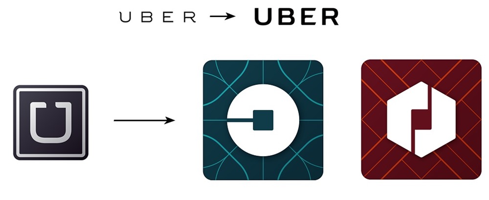
Uber has unveiled its new logo from 2016 onwards, which is quite different from the existing logo. In fact, Uber has redesigned logos for both riders as well as partners.
The updated logo can be seen with the updated apps on Android, iOS and other operating systems. The drastic difference between the existing logo and new logo has attracted all kinds of mixed reactions from the users. But, most of the users have been quite critical of the new logo, and have given negative feedback!
About the change in logo
The new logo is different in terms of the graphics to represent the ‘U’. The old logo was a minimalistic ‘U’ to represent Uber in a black background. The new logo is a circle with a square at the centre connected to the background black through a thin stripe. Specifically for Indians, think of it an a 90-degree rotated logo of State Bank of India, only in white colour and black background with fancy lines running through it.
Uber says the logo has been inspired from ‘Bit’ and ‘Atom’, which represent building blocks of technology. While it may sound very philosophical and inspirational, Uber has actually put a lot of thought while making it.
The round design represents the atom, with a square hammer like middle to represent a bit. According to Uber’s website, the design is now more in line with company’s vision and since it is not only limited to cab-hailing service, it made sense to capture other elements as well. Uber has now moved into groceries and food delivery worldwide and plans to get into logistics business soon.
Uber’s newsroom website mentions, “When you push a button on your phone, a car moves across the city and appears where you are. We exist in the place where bits and atoms come together. That is Uber. We are not just technology but technology that moves cities and their citizens.”
The post also talks about the creation of the new logos, “One of the big changes over the years is that Uber no longer moves just people; we’re now moving food, goods, and soon maybe much more. With the potential for many apps with many app icons, we needed one approach that connected them all. So we came back to our story of bits and atoms. You’ll see that both rider and driver icons have the bit at the center, and then the local colors and patterns in the background. This is a framework that will also make it easy to develop different icons for new products over time.”
To be honest, when I see the new logo first, Uber does not come into my mind. The iconic ‘U’ has been left behind to make way for a new thinking.
It is a fresh start in terms of what Uber plans to do in near future, but it did face some critical reactions from fans across the world. Nevertheless, it does not change the fact that Uber is still a pioneer in the taxi-hailing industry and is getting better and better in other facets.

[…] […]