If you are like me, you hardly use any native desktop apps. I’m a browser mostly (if not browser only) user. The only local apps I use on my Mac are Skype, Spotify and Airmail. Email is a major thing for me and hence I went for a paid app client like Airmail which is not just clean also offers an unified for all the email accounts I own and a plethora of really handy keyboard shortcuts which also utilizes the multi-touch gesture in the trackpad. However, from time to time, I also use my email inbox using the browser. I’m not a fan.
I clearly remember why I switched to Gmail from Yahoo/Rediff 5 years back. The interface, which felt so wonderfully balanced and focused on the emails, the choice was obvious. However, with more rolled out features and growing number of labels and filters, the interface now is overwhelming.
Also the ads catered have increased in numbers making it a tad distracting for being productive in your email time (which is hardly productive anyways). With all these in mind I made the switch to a paid native app. However, I still feel like getting back to my browser experience.
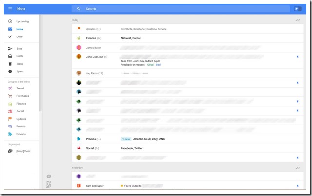
Thankfully, Gmail has been testing on a new design lately and very recently some images were leaked which looks like a revamped Gmail web interface. And to much of my amazement, it yet looked email focused, which certainly is good place to start talking about it.
Contents [hide]
Cleaner and Flatter Email Layout

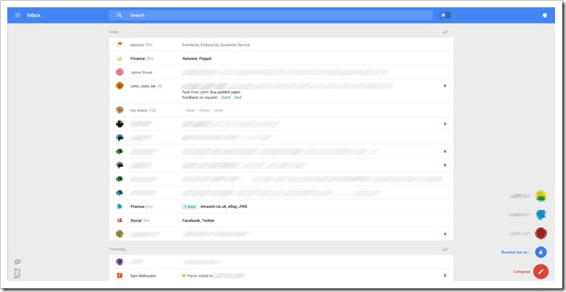
The most obvious change in the new design is that it is strictly email focused. Most of the screen if you can ignore a few small buttons here and there only comprises the emails listed chronologically separated by days. The flat UI looks very nice as well.
Slide In Left Menu: The left column with labels and sections are now a slide in element of the page. What that means is it stays out of the screen as long as you are now using it. It only slide backs in if the user uses it.
Circular Compose Button To Bottom Right:

The design includes a circular button to the bottom of the right side of the screen clicking which opens a linear cluster of circular buttons. The compose button and the remind button are located here.
Big Search and Pinned Emails
The top of the screen houses a big search for and toggle button with a pin. This one supposedly allows an user to show pinned emails at the top of the screen when turned on. Pinning is expected to be the replacement for Starred emails.
Top Right Hangout
The flat design has also moved the the hangout to the top right corner next to the search which currently houses app button, google plus notifications, account settings etc.
There are two buttons at the bottom left corner. We are unsure of what it is for. Email is a strictly routine oriented essential task we perform everyday, and we seem to form a habit around it. Google has been subtle in rolling out designs to not alter the user experience drastically. However, it is still unsure whether this features or design shown in this layout will ever be released for the public.
[via Geek.com]
