Trak.in redesigned!
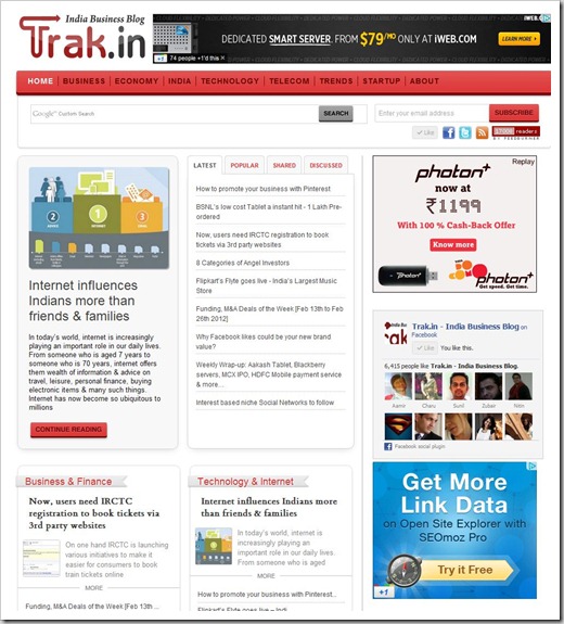
Trak.in redesign has been on cards for a while, and it is finally done. Its been close to 18 months since we have had our last re-design. We have taken a very different approach this time around, moving away from a more traditional blog look to a more categorized content presentation on the homepage.

We have also made quite a few changes in back-end to ensure that blog loading times are faster. Any new visitor landing on trak.in homepage can now get a complete overview not only our latest published posts, but also the most popular and most shared articles. The content is also presented based on different verticals.
We have tried our best to keep the look and feel as simple as possible with ample whitespace making it easy on your eyes to read. We are still playing with typography of headings and body text and you may see some changes in next couple of days.
The feedback to new design has been quite encouraging from readers who had chance to look at it earlier. We are quite confident our regular readers will love the new format.
The new trak.in theme has been created by talented WordPress developers at WPoets – they have been extremely accommodating to all the requests I have thrown at them. I would highly recommend them for any kind of WordPress design & development projects you may have!
I would also like to thank Nayan Deshmukh of Webonise Labs for providing us with the broad structure of the new design based on which this new trak.in theme was developed.
If you have any suggestions or feedback about our new design, please do not hesitate to get in touch with us.

hello arun sir, following this blog for long time and best wishes to & your team for this changeover. it’s really great. :)
Hi Arun,
Looks great! Awesomeness Redefined I can say :)
Thanks Chirag…
Suggestion: The height of the sub-menu which comes when the cursor is moved to top menu is very less. Selection from the sub-menu is not user friendly.
Thanks Aakash for the suggestion – I agree…the submenu is somehow not come out as we had expected…we are planning to make some tweaks…
Best wishes for the whole team involved in this changeover. Yes, a changeover once in a while is good.
The best part I liked about the change is the ‘ ample whitespace’, makeover
Safe ePayments motivator
http://prashantnepayments.blogspot.in/
Trak.in redesigned! http://t.co/f0wa1WSN via @trakin
Trak.in redesigned! http://t.co/TBzvL6me
Just a Suggestion: Beware with the Top Menu Almost Overlapping the Adsense text Unit, you might be the dreaded email from Google :)
Thanks… I did not even think on that one… Will keep it in mind
#startup #tech Trak.in redesigned! http://t.co/D88myehV #DhilipSiva