Snapdeal Redesigns its Logo in Vermello Colour to Align With its Ideologies & Brand

First Airtel did it, Yahoo did it, then Uber and then Micromax followed, and now it is time for Snapdeal to change its logo. Changing a logo is a very big deal, because it is the identity of the company and that is how the customers associate with the brand.
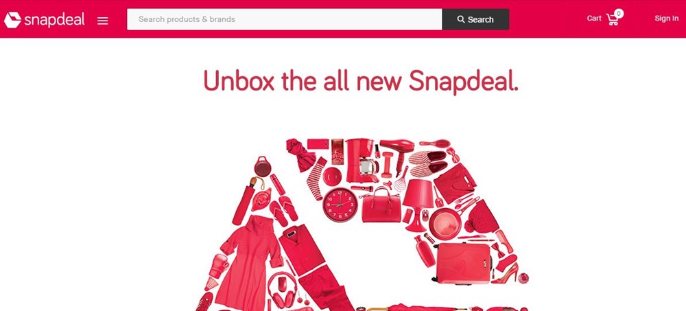
In a series of tweets in the past week, with the hashtag #UnboxNewSnapdeal, Snapdeal has been working towards unveiling its newly redesigned logo. The logo is completely different from the existing one, that feature the company’s name in blue and red. The new logo is in colour white in a bright red background, has a strange shape and a flat design.
Here we #UnboxNewSnapdeal! pic.twitter.com/afomVcEDWp
— Snapdeal (@snapdeal) September 11, 2016
India’s third largest online marketplace, Snapdeal, has launched the new logo as it overhauls its business model. It is said that this effort has been led by Rohit Bansal, Co-Founder – Snapdeal, and McCann Erickson, a global advertising company. The company has also invested $200 crore into its marketing efforts for the next two months.
Snapdeal’s website reads, “Our new brandmark, while implicitly simple, has a powerful, uplifting message embedded in it. The box captures the moment that we reach your doorstep – a moment that we know holds immense anticipation, excitement and delight for you. Look closer, the two arrows of the box represent our role as your partner and enabler on the journey ahead.”
Speaking further about the logo, the colour used in the design, that appears to red to the common man, is what Snapdeal calls “Vermello”, representing the aspirations of Indians. We wonder if the company’s name in white signifies peace?
At first the logo might not look what Snapdeal has hoped it would, but gradually it gets to you. Since it’s a flat design, the idea of a box does not straightaway come into the mind. However, if you look closely it does look like a cube with one end shaped like an upward-facing arrow, like in Housing.com’s logo.
Does it mean the company is moving away from just being an online marketplace? No. But if you remember the recent tie-ups with other companies like Zomato, Redbus, Uber and Cleartrip, Snapdeal might be looking to become more than just an online marketplace for products.
The logo sure looks bolder and brighter now, and Snapdeal hopes to make a bold statement with this design. Did you like the new logo? Tell us what you think in the comments below.

The new snapdeal logo doesn’t look much stronger than it’s predecessor. The typography is nicer but the addition of the logomark isn’t adding any strength to the over all mark. It’s either a box with a hole in the top or a box with no bottom. Neither really seem like something you would want when your items get shipped.