Rediff’s New Redesign: Cheap imitation of Pinterest! #fail
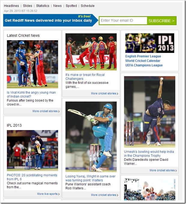
Did you see Rediff’s new Homepage? If you have not, here is a look at it…

So which site does it remind you of? Yeah, each one of you are right…
Rediff’s new design looks near replica of Pinterest and it is really sad that a company like Rediff decided to completely copy Pinterest.
I am not at all going into advantages and disadvantages of this design – my biggest disappointment is how they have blatantly copied without giving much thought.
Much more is expected out of them…
Yes, the “tiled” style of look is the latest rage, and from consumer’s perspective, it is good as well. But, Rediff could have easily incorporated a little different styling even in basic tiled design framework.
Now that my disappointment is out of way, let us discuss a little bit of design itself.
The Rediff homepage had incorporated the tiled structure and so are the sub-pages, so if you go into a any of the various category tiles, you will get a tiled page of all latest stories for that category. So lets say you click on “Cricket”, you will get a page like this.

From reader’s point of view, the design is definite improvement over previous barebones design. In a single view a reader is able to see lot more categories and recent stories than what was visible previously. So, it is more likely that reader will be led to his own interest areas in lesser clicks.
The single article view remains the same, most of which are picture stories that I hate. Simple reason being there is hardly any content. They generally consist of large image with 2-3 lines of content which are paginated in 10 –12 pages. What this does is, for a reader to complete a story, he has to click multiple times (a way of increasing pageviews from publishers point of view).
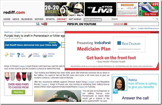
For articles that are not picture stories, readers are forced with so many ads, that the entire story is nearly invisible. Look at the screenshot below.

As you can see, on a single story about there are 5 or more ads that a visitor sees, completely screwing (yes, that’s the word) up the experience of a reader.
Yes, Rediff has been witnessing big losses over past few quarters, but this is absolutely not the way they will be able to increase their profits. If anything, they will only loose out on more readers!
Overall, I am extremely disappointed with Rediff’s new redesign. Would love to know what are your thoughts on this!

It has been about a year since this article was published. I wonder how rediff is doing now? Personally I hated the new design. Thought that it might grow on me but never did. I still occasionally visit the site, look at those images and right away close it. Unless numbers say something different, I get a feeling this was Rediff’s way of committing a slow suicide. Where I used to visit it multiple times earlier, was my favorite site for news, now I visit only once in a blue moon.
Hi Arun
Personally, I don’t enjoy Trak.in’s new home page design. Too many images, too big images, very less content. Scrolling through becomes slightly jarring to the eye. But then, this is my personal view.
Cheers
Mohit
@mohit – Hmm… sorry to know that you did not like the new redesign. For some, the homepage may look a bit cluttered, but all our single post pages have thrust on content rather than images… Also, 90 percent have liked the new design of Trak.in. You are only the second person, who has disliked it… After all, it is too difficult to satisfy everyone..
One of the main reasons, why we changed the design was responsiveness. Please look at trak.in from your tablet or mobile and do let me know what you feel.
One of the issues with publishers is that there is wide array of screens and resolutions from which the site gets accessed and to optimize it for everyone is extremely difficult… Still we tried our best.
For example, at 1024 resolution you will see on 2 sidebars. From 1280 and above wide resolution, you will see 3 columns and for 800 and below you will only one column…
@Arun. No issues with the design or the layout. It’s just that too many images (and that too big ones) take the focus away from the content. But then, I agree it is not possible to please everyone :-)
it would have sounded a little more objective if you suggested solutions, instead of sitting and sounding like the jury below the ramp..ogling :)
I think it is remarkable that the company stands against all odds and trying. It isn’t backstopped by american dollars from any parent company, not indulging in advertorials, managing the ratings. If it seems a little sloppy in execution, don’t forget there advertisers who demand get the their strip-shows. Well, even the local yahoo do a tear of their homepage to break even.
rediff has stopped those blocking ads, at least, on the home page. Still produces great columns, though the slideshows are amusing and sad with their gimmicks
I liked the real-time news, specially the one with hover over local maps. Really innovative.
The email is still highly functional and useful, though erratic once in a while, which is expected of any site. Look at Google’s service levels on their own site !
If we need local guys to compete and not slide, we have to turn our attention to the bigger challenge and ask why we don’t have or deserve a cost-effective and truly-always-on Internet. I heard some bureauc-rats say there isn’t enough demand ! Google’s resident claims 120 million Internet consumers. He has to say that to get the support from his US office!
However global we might get and appreciate quality, which we all should, it is important to root for the home team. We tend to vent transfer over anger over state of affairs in India, to anything local. We seem to admire those use any ways and means. If someone is hungry and doesn’t care where the bread comes from, that is still understandable. We have a breed and a section of people who are essentially criminal in their mindset – either affected and damaged, or just the old feudal genome.
We need to keep our individual and collective identity.
@Bharat – I am not an expert. The point of this article is to express my disappointment to Rediff’s Redesign. Yes, like I have said earlier, I may have come across in a little harsh way, but the point remains the same. They could easily have done a much better job. They needed to give little more thought to User experience and in my personal opinion, it is lacking.
You spoke about blocking ads…although they are not there, they still have pop-up ads, which I think are worse.
And, I am not saying that they dont have some good features like real-time news…my gripe is only with their redesign and I stand by what I have said..
On a positive side, yes Rediff does load fast probably the fastest of all and I like that!
Arun – I probably got carried away. We expect so much more but get very disappointed when companies or people that we like, or liked, don’t get measure up. There is a lot for rediff to do, to hold its consumers and any imitation, inspired, under duress, or otherwise, has to be backed up with execution.
I see the pictures, slideshows and get irritated too. No one can excuse such breaks in user experience.
It isn’t just abput the load time, I was trying to look at a few positives and trying to understand, like you folks, why they mess up, despite innovations. My guess, is that, like Yahoo, they have to dabble a little less and focus instead.
I just can’t accept that one has to get sleazy to scale in our country. So, to that extent, it might help to analyse and seek opportunities with have some solid reviews and case studies. where leaders succeed, fail or fall. We all need an Indian hit.
I am sure there are many who can match the load time. Such heroics don’t suffice and that can’t be a slogan for sustenance, even on a creaky infrastructure.
Rediff is a “Made in China” website. Cheap, quick, come to the point, use and throw.
What I like is the site pages are the quickest to open. So multi-clicks dont bother (though it is annoying)
What I hate is the discussion boards under each page. It opens up the animals in people. The amount of hate that flows in those discussion boards is unbelievable.
They dont even review article contents. Most of the time it is cut and paste from other sites. When seens from Indian context, the article looks silly. But Rediff dont care.
Over all Rediff business model must be get as many eyeballs or clicks or what ever, regardless of the content.
I never read any article on rediff. I use Rediff only to see graphs of stocks which is very quick compared to graphs of hdfcsec, money control etc.
Just my two paisa :)
ALtaf – That is one thing I have to concede about Rediff – They have the fastest load times of all the sites I have seen. Pages and images load in a snap, no doubt about that.
But the 3 important pillars UI, UX and Content leave a lot to be desired.
Arun,
You probably are a little unfair in ripping apart rediff for getting “inspired” by pinterest. There are 1000’s of others who have successfully done it, and when it comes to web design and keeping up with the latest trends, there are only so many ways you can skin the cat.
I dont blame rediff for using the UI, but where they screwed up is by not complementing it with the great UX. I can imagine that happening for a business like rediff where they need to integrate lot of channels which they are not in control of, and it very well could be the case of the business people doing a shity job at understanding whether the UI does justice to their business line..
Cheers
Srini,
I do understand that I may have gone a little over the top in ripping them apart, but it is also because, I want them to come up with something better (also because, I think they have the wherewithal to do it).
While the design is one thing – see their content and advertisements. They have pop-ups all over for God’s sake. How can you have that in today’s age? Rediff has created a brand, but by doing such things they are bringing themselves down…
Grand Pa Rediff still exist wow thats a great news . whats up Grand Pa , how are ya ;-)
Hey Ankur – I absolutely hate Rediff’s single pages. Cant complete a thing without clicking multiple times… and when the article does not have images…it is full with ads.
Yes, thanks ..Glad you liked the new design. Trak.in underwent a redesign because it needed to more responsive. Check it out on tablets and mobile, I am sure you will like it more…
you page broke the first time I tried to load it, I had to kill it and load again.
Responsive ?!!! sucks time on a broadband connection.
@Bharat – How did it break? It did not load? or what was the issue? And about responsiveness, again I just checked it and it is perfect. And if you are keeping Rediff as the benchmark in loading times…Sorry, Trak.in cannot compete with it..
If you can tell me the issue, I can probably fix it!
Arun
It did not load the first time. I had to refresh to reload. The image was loading… and chrome showed an option to kill or wait after a long time.
If you have an engineer around, he could profile the load times of various components, many of them.
It could also be the MTNL’s broadband connection playing truant.
In terms of benchmarks for speed, there are many others, I was not comparing. i would think it is simpler to solve..unless you have nested ad networks’ scripts.
Absolutely. Rediff seems to have a very non-creative bunch of people in both the design and the content departments.
Their multi-page-with-nothing-new look has always been a big turnoff!
P.S. on another note, trak.in’s new design seems awesome. You have to give some lessons to people like us :p