Horlicks has for years been the most famous health food drink across India. How many of you remember your Mom saying “Son if you want to become healthy, you should Horlicks daily?” It had always positioned itself as the one stop health beverage. But over a period of time it has diversified into biscuits, nutribars and instant noodles with varying degrees of success.

GlaxoSmithKline obviously realised that the number of different products across the Horlicks spectrum had increased in number. Consider this – Horlicks is worth more than Rs 1500 crore with its vast array of products has evolved into an iconic brand for GSK. From being a health drink to a brand which caters to the entire segment of health and wellness, it’s been a long journey. Therefore a unification strategy of the different products was necessary. Wasn’t it?
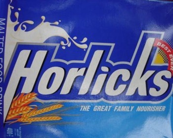
This gave GSK the thought of unifying the logo, packaging and designing across all the product categories of Horlicks. The new look and design have evolved from consumer research across the segments along with attributes of the brand.
The elements in the new design are: –
- The ‘Wave’ on the packaging shows the ‘activity’ of a person
- The visual of milk and wheat shows the nourishing capabilities of Horlicks
- Blue and orange colours have been part of the Horlicks family for many years and strongly help to identify the brand
- The new logo also plays a role in reinforcing the trust and equity of the brand among the consumers
Is changing packaging, logo, design, style etc. really important?
Horlicks has been an iconic brand for many years. Does it really need this change and also above that a spending of 300 cr to promote it?
One of the most important aspects of this campaign is to unify all the products together so that a consumer doesn’t identify different products as coming from different brands. It is a way to reinforce the brand name – Horlicks in the minds of all the consumers across all product categories.
The packaging in a plastic jar instead of a glass bottle is a way to make the brand easier to handle and use. A uniform size and shape for all bottles would also help in reducing the costs of producing different sized bottles.
The new design would also be able to act as a strong base for GSK to launch its new brands or sub brands if any. This has been done with the aim of moving Horlicks to the level of an umbrella brand with many sub brands under it.
All in all, it would be interesting to see the buzz the entire strategy creates over the next few months.
Do you think changing the design, packaging, logo etc. make any difference?

I think Packaging,logo and style are the most important things in designing a product.A product is complete only if it has all these.Remember the following quotes:
“Design is not just what it looks like and feels like. Design is how it works. ”
– Steve Jobs
Yeah your are completely right. But along with that the product also has to support these features. Without a good product everything else will be reduced to nothingness.
I dont think changing the logo , designing or packaging makes any difference as the quality remains the same…Horlicks has been a trusted brand for many years and people will continue to use it irrespective of whether it comes in a new package or not
packaging is very important so as to show what the company wants others to perceive about its product. If the product is good but the packaging is horrible, people wouldn’t really like it too much..